Been really into gold foil tarot cards lately. It’s not like I need more decks in my life, but there’s something about how the light catches those metallic accents during readings. When it’s done right (not just slapped on every border), the foiling actually brings the symbols to life.
My problem? Most of the gorgeous gold foil decks are all Marvel this, Disney that. I want that luxe metallic treatment on something more traditional or artistic. Does anyone know of gold foil tarot cards that enhance the mystical vibe without being franchise-themed or tacky?
Especially interested in indie publishers doing cool stuff with metallic finishes.
I like gold foil cards but they can be hard to read sometimes. The shine gets in the way when there’s too much light. They work better in dim lighting though. That’s when you can actually see what the card is trying to tell you.
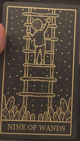
Check out the True Black Tarot. No gold foil but the golden artwork on black backgrounds looks great. Art Nouveau style, really nice contrast. Might give you that luxe feel you want even without the metallic finish. The cards themselves are good quality too if you get to handle them.
I’ve been playing around with reading my gold-foiled Cups cards while having some chamomile tea. The steam catches the metallic highlights, giving off a dreamy vibe that really enhances the water element energy. For Major Arcana cards with gold accents, I like to pair them with a golden turmeric latte.
The spice adds warmth, making cards like The Sun or The Star glow more during morning readings. I also discovered that peppermint tea pairs well with gold-edged Swords cards, matching their crisp lines nicely. Preparing different teas for each suit has made my readings with the gold foil deck feel more on purpose and special.
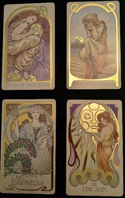
I was just thinking about the Queen of Cups. The Ethereal Visions Tarot really nails that dreamy, flowing energy. And if you’re into elegant art, the Golden Art Nouveau Tarot might impress you with its lines and classic beauty.
These decks have a way of bringing the cards to life.
I’ve been noticing gold foil catches my eye more than silver or holographic finishes. The whole solar energy/alchemy connection with gold is interesting too. Anyone else feel like gold accents change how they read?
I picked up Caitlin Keegan’s Illuminated Tarot recently. The foiling is pretty restrained, just touches here and there on key symbols. Works better than decks that go overboard with the metallic stuff.
The Mystic Mondays deck caught my eye with the rose gold, it’s different from the usual gold you see everywhere. I find it works well for relationship readings.
They only put the metallic touches on certain elements like the celestial and geometric designs, so it doesn’t look overdone. Uusi has some limited editions too if you’re looking for something handmade, though they’ll set you back quite a bit.
I’ve been using the Golden Art Nouveau Tarot as well and the artwork is beautiful.
The way they combined classic tarot symbolism with Art Nouveau style works really well. What I like is that even though it’s artistic, you can still easily read the cards if you know traditional meanings. The gold accents are nice; they catch the light during readings.
And all those curves and botanical elements somehow make even difficult cards feel less harsh. The court cards are my favorite part. They kept the royal feel but added those Art Nouveau touches throughout. Just wondering if anyone else has noticed how this deck seems to bring a different energy to readings.
I’ve been playing around with gold foil decks lately and tried using them with elemental spreads. The gold really makes the fire and water cards pop in a different way.
I like using gold foil cards with candles sometimes. Yeah, they can be super reflective, but if you angle the candles right, it looks pretty nice. The key is not going overboard with candles. One or two max, and keep them off to the side so you’re not getting that glare right in your eyes when you’re trying to read. LED candles work too if you’re worried about safety or whatever. Some of them look pretty realistic now and you can adjust the brightness.
I started with a basic Rider-Waite deck and honestly, I’m glad I did. Those gold-foiled ones are gorgeous but there’s already so much to learn without extra visual stuff going on. That said, I know people who started with complex decks and did fine. If you’re drawn to a particular deck, maybe that connection is worth more than having simple images.
Just a heads up for anyone with gold foil decks, keep them out of direct sunlight.
The sun fades the metallic parts way faster than you’d think. I’ve been storing mine in a drawer in my bedroom. Room temperature, no moisture issues, and definitely no sun damage. The difference between my stored decks and the one I left on my windowsill is pretty dramatic.
Worth taking care of them if you paid good money for those fancy finishes.
Had my King of Swords out for a reading and the gold foiling caught the candlelight perfectly. Was dealing with a pretty complex situation for someone.
The metallic parts drew my eye to power dynamics I hadn’t really paid attention to before. Been thinking about getting the Luminous Spirit deck, they put their gold accents on meaningful symbols instead of just slapping them on borders.
How have we not had the Ethereal visions deck yet? Aside from having gold foil on every card it’s also one of the most stunning looking decks and it doesn’t rely on the foil to make it look good. It’s just a bonus.
Mine started with one gold-foiled Hermit card catching the light during a reading and now here I am with way too many decks. Check out the Modern Witch Tarot gold edition if you haven’t already. The foiling actually follows the energy lines instead of just being slapped on the borders.
Fair warning though, once you start noticing that metallic shimmer during shuffles, regular cards start looking kind of plain. And don’t even get me started on the Etsy rabbit hole of people doing custom gold leaf work on vintage decks. My bank account hates me.
True Black might be worth checking out. The gold on black contrast is pretty good without being actual foil. Did you cleanse it when you got it? I feel like metallic accents need it more than regular decks.