Forgetting anything other than aesthetics, what do you think are the most beautiful and prettiest Tarot decks?
We have the cool deck list. We have the cute girly deck list (close!) and the most popular decks. But taking everything else out of it other than the look of the cards what is the deck you just vibe with. The artwork or the style of the cardstock. Whatever it is that makes the cards pretty.
But if I set aside my own personal preference, then this is one of the more popular decks for a reason. The photo doesn’t really do it enough justice. These are some of the best quality cards with this unique look and gold foil that doesn’t just flake off like cheap decks.
They’re lighter, easy to work with and even when they’re not really my style, I’ll admit… they are beautiful.
I actually just posted this an hour ago on another thread but if you don’t mind a novelty deck (that’s straight to my suggestion) then I really like some of the decks there. It might be fun cards to some, but the artwork is seriously impressive.
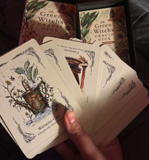
For something a bit more normal, then this is great for anyone who has an affinity with nature (or even if you just love the art style):
I love these suggestions and I think @Sploots and I probably have a lot of the same decks.
The Prismavisions deck really is beautiful. Each card looks like a dreamy painting with all those swirling colors. I keep finding myself staring at the artwork longer than I probably should.
I saw someone posted about the Trueblack deck too. Ended up ordering their holographic edition on impulse, the way it catches the light is pretty cool. Sometimes you just want a deck that looks nice.
There’s nothing wrong with wanting a deck you like the look of. The more you actually like the deck you’re working with, the more likely you are to use it. There’s a difference in working with what you resonate with and vanity.
This is a popular deck but it’s still somehow more niche than I ever expected. I really like the style of both the packaging and the cards themselves which is rare (usually one or the other for me). Might fit what you’re looking for.
The Fyodor Pavlov Tarot by Fyodor Pavlov has a soft, dreamy vibe. I can get lost in the art.
The Ethereal Visions Luna Edition by Matt Hughes has a nice flow to the colors and a calm feel.
I also found Children of Litha by Xia Hunt-the artwork is striking.
Same with the Wandering Spirit Tarot by Hanueli Shin; the style makes me want to frame a few cards. If you’re into a darker, fairy-tale mood, The Dark Wood Tarot by Sasha Graham and Abigail Larson delivers. The Urban Tarot by Robin Scott brings a clean, modern look that I really like. I mostly end up treating these as art pieces and flipping through them.
The Tarot of the Divine is really beautiful. Each card shows a different fairy tale or myth from around the world, and the artwork connects symbols from different cultures.
Artist Yoshi Yoshitani does something interesting, she creates images that feel familiar to everyone but still keeps the specific cultural style. Like when The Star is shown through an African folktale or The Fool comes from a Japanese myth. clients respond to it differently than other decks. Seeing their own culture reflected, or even just seeing these universal themes through a different cultural lens, seems to hit them in a different way.
Terra Volatile could be a good fit if you like decks with detailed artwork. Each card has its own illustrations and they have variant cards plus 14 extra Vessels.
The art is really nice and you notice different details when you use the deck. You can check out more on their website if you’re interested.
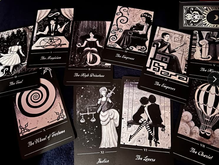
If we’re talking about looks, I really like Tarot of the Abyss. The black and white pen art is beautiful.
For quick yes/no pulls (yeah I do them too), Mystic Mondays works well. The geometric design makes it easy to read quickly. Anima Mundi has muted colors that keep things calm during readings. Do you find that certain color schemes affect how you read yes vs no answers?
I used to roll my eyes at collage decks as ‘too busy,’ but Dreamkeepers Tarot changed my mind. The layered images feel like looking through someone’s dream journal.
OP mentioned aesthetics, Star Spinner’s bright pastels on thick matte stock look really comforting to me. Oak, Ash & Thorn has this soft graphite and watercolor look that’s pretty calming. Do you like borderless cards or ones with fancy frames? Does foil edging make them prettier for you or is it too much? Since cardstock came up, do you prefer that soft matte finish or the crisp linen texture where colors pop more in bright light?
It’s a really hard question to answer. I like the idea of just scrolling through decks until something pops out at you.
Beauty is subjective, depends who you ask. I’m drawn to the darker, high-contrast decks myself.
The Tarot of the Abyss by Ana Tourian has this gothic feel that I really like. Da Brigh Black by Victoria Iva has great contrast, dark backgrounds with bright details. And The Phandomwise by Erin Morgenstern has this midnight vibe going on.
I know these aren’t everyone’s cup of tea. Some people prefer the bright, colorful decks with lots of pastels and florals. My taste just runs more toward the moody, dramatic side of things.
The Thoth deck has some really striking artwork. Lady Frieda Harris used these bright colors and geometric patterns that make the cards stand out. You don’t need some new modern oracle deck to find artwork you like.
The Major Arcana are especially vivid, cards like The Aeon and The Universe have all these colors and symbols packed into them. Some people find it too busy, but I like how dense the imagery is. Kind of reminds me of medieval manuscripts but with a psychedelic twist. Anyone else find themselves staring at the details in these cards during readings? Sometimes I get distracted by all the symbolism.
When I first lay cards out for someone new to tarot, I often hear them gasp at how beautiful some decks are. The Thoth tarot has always been my favorite, Lady Frieda Harris’s artwork has this flow to it with all the bright colors and geometric patterns. Each card feels like its own little world.
The way she painted those swirling colors and details just hits you. I’ve been so into the imagery that I got a whole sleeve tattooed with stuff from the major arcana, the Fool’s leap, the spiraling universe from the Aeon card, the waters from the Cups. There’s something about how the Thoth deck combines the mystical look with emotional intensity that makes it really captivating, even before you get into what the cards mean.
For visual beauty, I really like the Ethereal Visions Illuminated deck. The Art Nouveau style gives it this glowing look that makes each card feel like stained glass.
The Prisma Visions deck is nice too. It has this flowing watercolor style that reminds me of Van Gogh’s paintings, which makes readings feel more artistic.
I also picked up Yoshi Yoshitani’s Fairytale Tarot recently. I like how it mixes fairy tale stories with tarot symbolism. The artwork is really pretty and it’s fun seeing familiar stories in the cards.
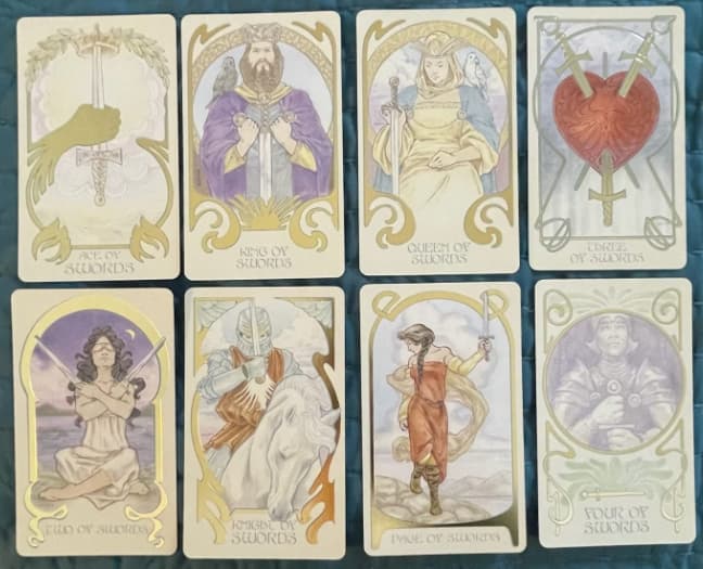
The Golden Art Nouveau deck is really pretty with the gold details mixed with the regular RWS imagery.
Cards like the 3 of Swords and Death look especially nice. The artwork helps when I’m reading for someone and need to deliver tough news, the pretty design seems to make it easier for them to hear.